

R’lyeah Wallet
#UX Case Study
01. Overview
This case study showcases a strong focus on the user problem and constant feedback from real users.
I'll walk you through the key insights and decisions at each stage of the design cycle🐙
TL;DR?
Highlights the meaning of UX tools by analyzing what I could have done better now with my formal training in UX Design.
02. Role
Duration: June - August 2024 (3 months)
Role: Team Lead, UX/Product Designer
Team: 3 members+Multiple participants
Platform: Lovable, Canva, Figma, Wix
I took the initiative to start a project to centralize the experience of the Table-top Role Playing Game (TRPG).
It became the most active channel in a Discord community with over 1,000 comments.
03. Problem
📈In Japan, the market for TRPG has been growing since 2020, with nearly 8% growth as of 2025. Yet, the tools used have remained the same since the 2010s. As a player myself, I realized the pain point of scattered tools for the players when organizing a session.
If you're new, imagine you want to play Monopoly online. You need to find the app to play, use X to invite people, and use another site to check if they know the rules or their level.
This case study specifically focuses on the problem-centered approach by pivoting at times.


What is TRPG?
TRPG is a type of board game designed to Role Play in a Movie.
Each Scenario acts like a story. But… Why is this relevant?
There was a frustration with the inconsistent user journeys for tools.
Imagine you are about to make a transaction on an e-commerce.
They redirect you to seperate page to see the product image, then to a different website to check the cart, and multiple steps to complete payment.
Annoying, Isn’t it?
Hence this project aimed to enhance User Experience. By introducing a solution.
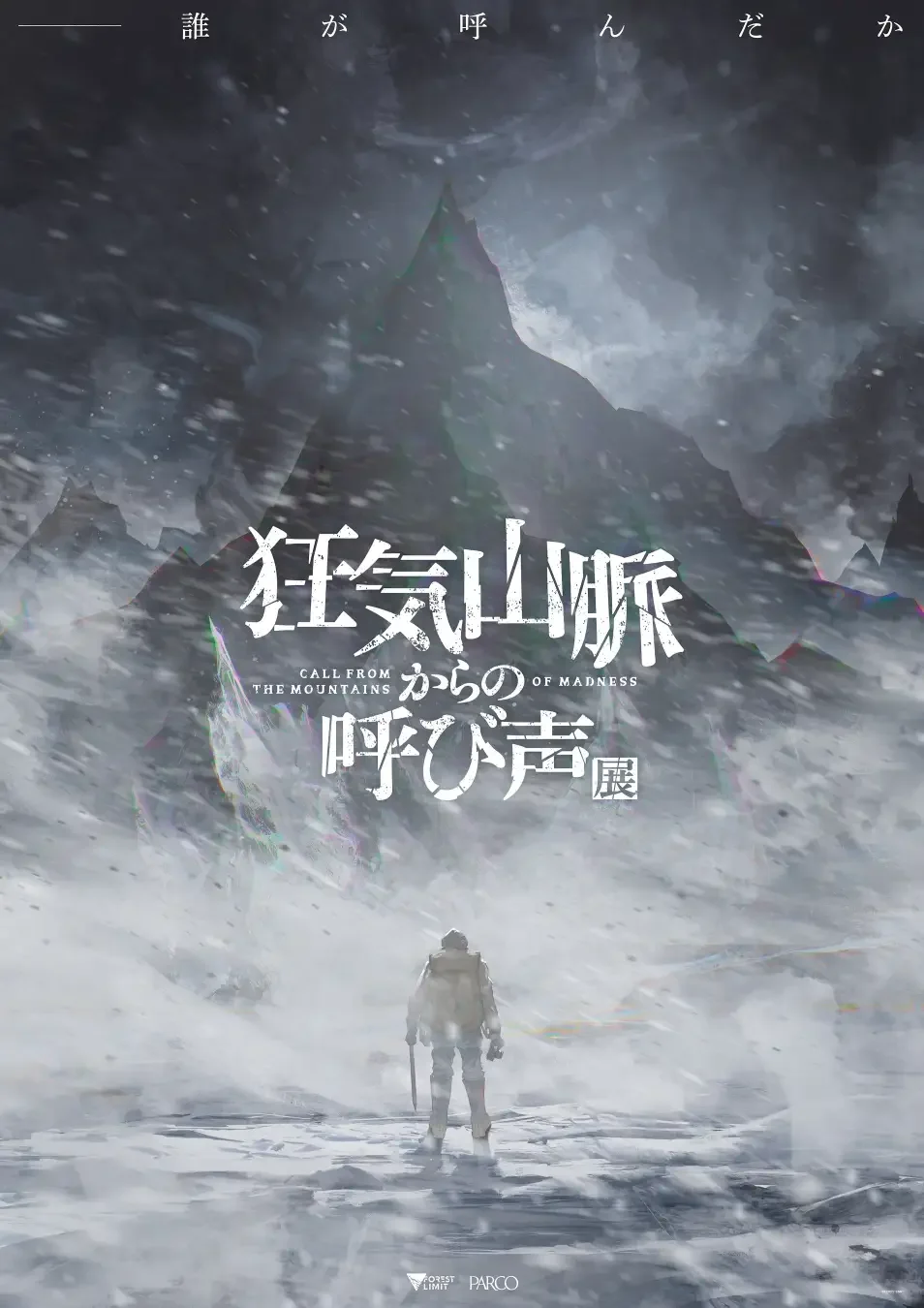
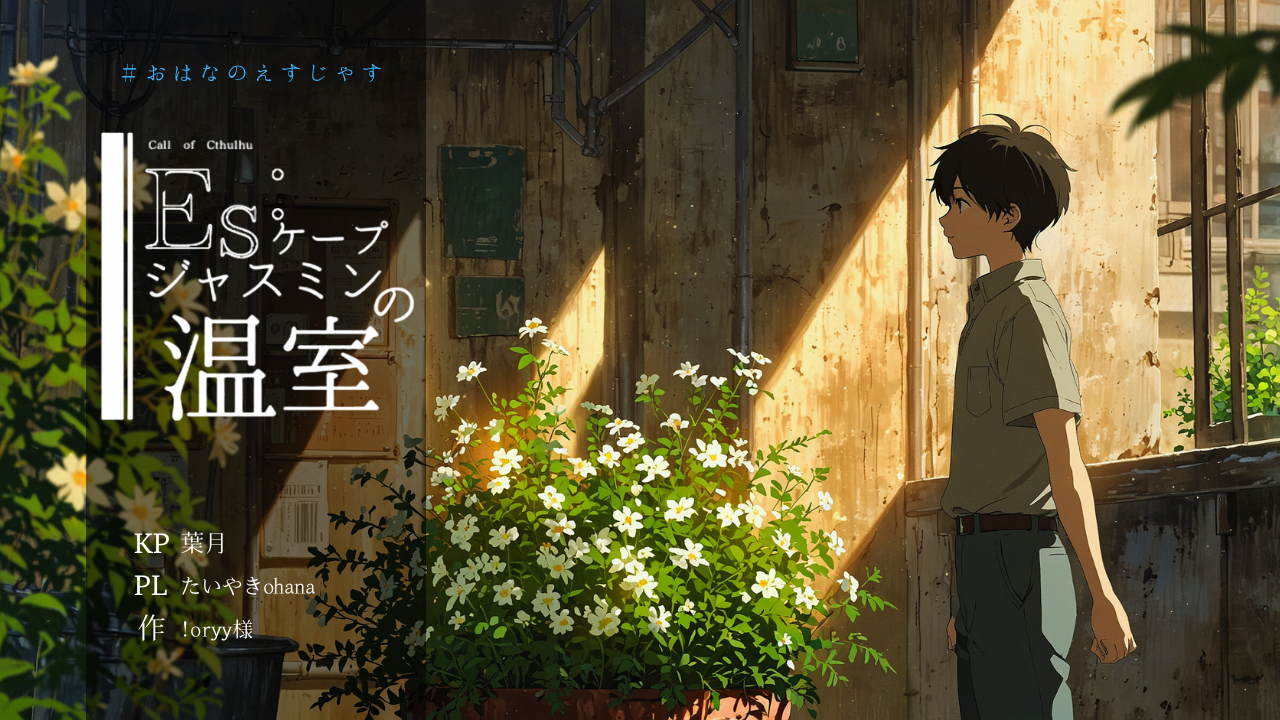
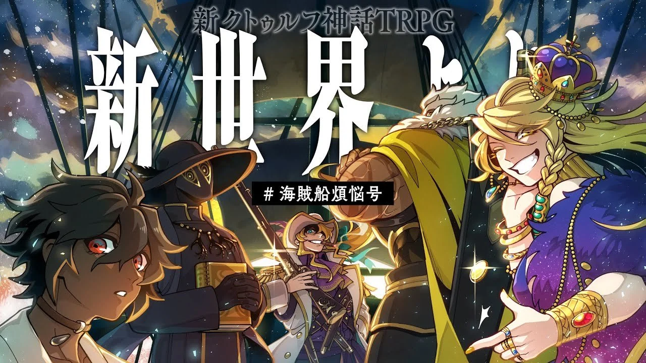

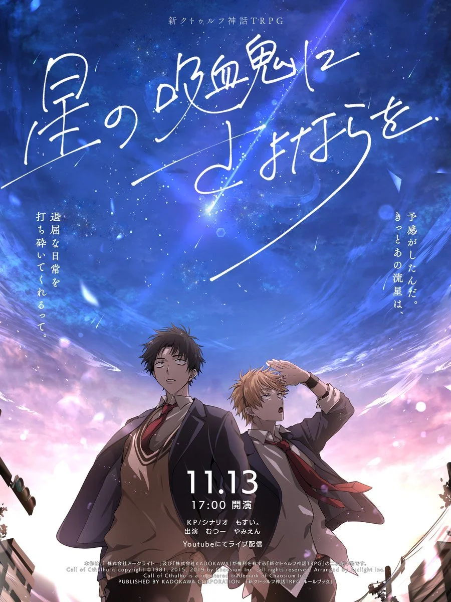
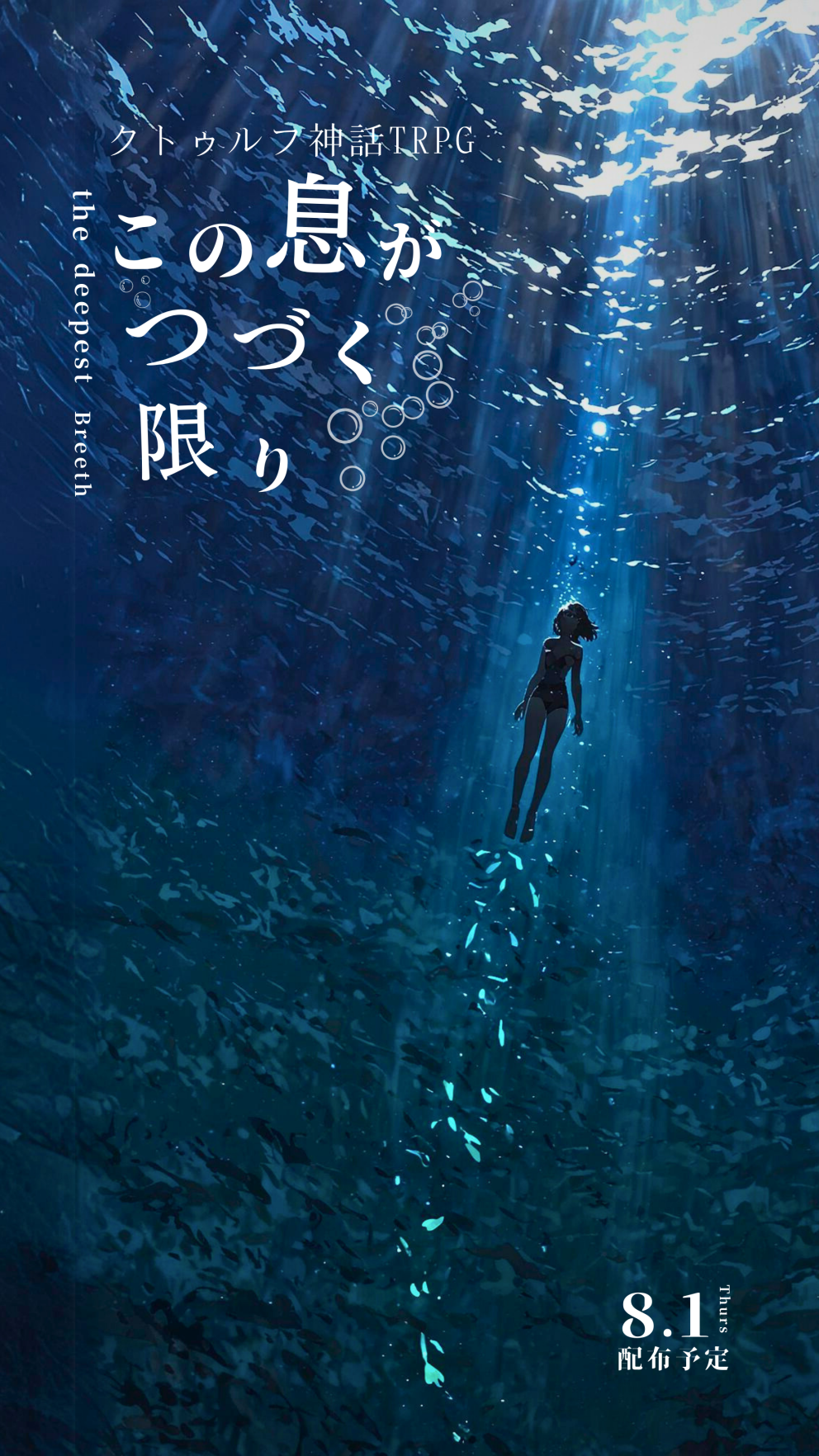
Image Credit to: Taijyu Nagai, むつー, まだら牛

04. Research&Challenge
Upon realizing this pain point and the potential, I utilized venues to reach out to 7 individual TRPG players with 3+years of experience. And 5 beginner-level players.
The outcome proved potential and challenges.
✅ Strong validation for a centralized solution. Most participants did not realize their frustration with managing multiple platforms. Once the potential solution was proposed, many gave indications on what could be different. Suggesting the user’s current journey.
⚠️ Concern about adoption was prominent, especially because they already had records on previous tools. And, onboarding anxiety because they may not switch until others start using it.
💡Realization of users’ hidden pain points. Some of the interviewees expressed the wish to have a centralized search rather than matching.
Outcome? Problem Statement?
“User needs a centralized tool before and after the game session.”
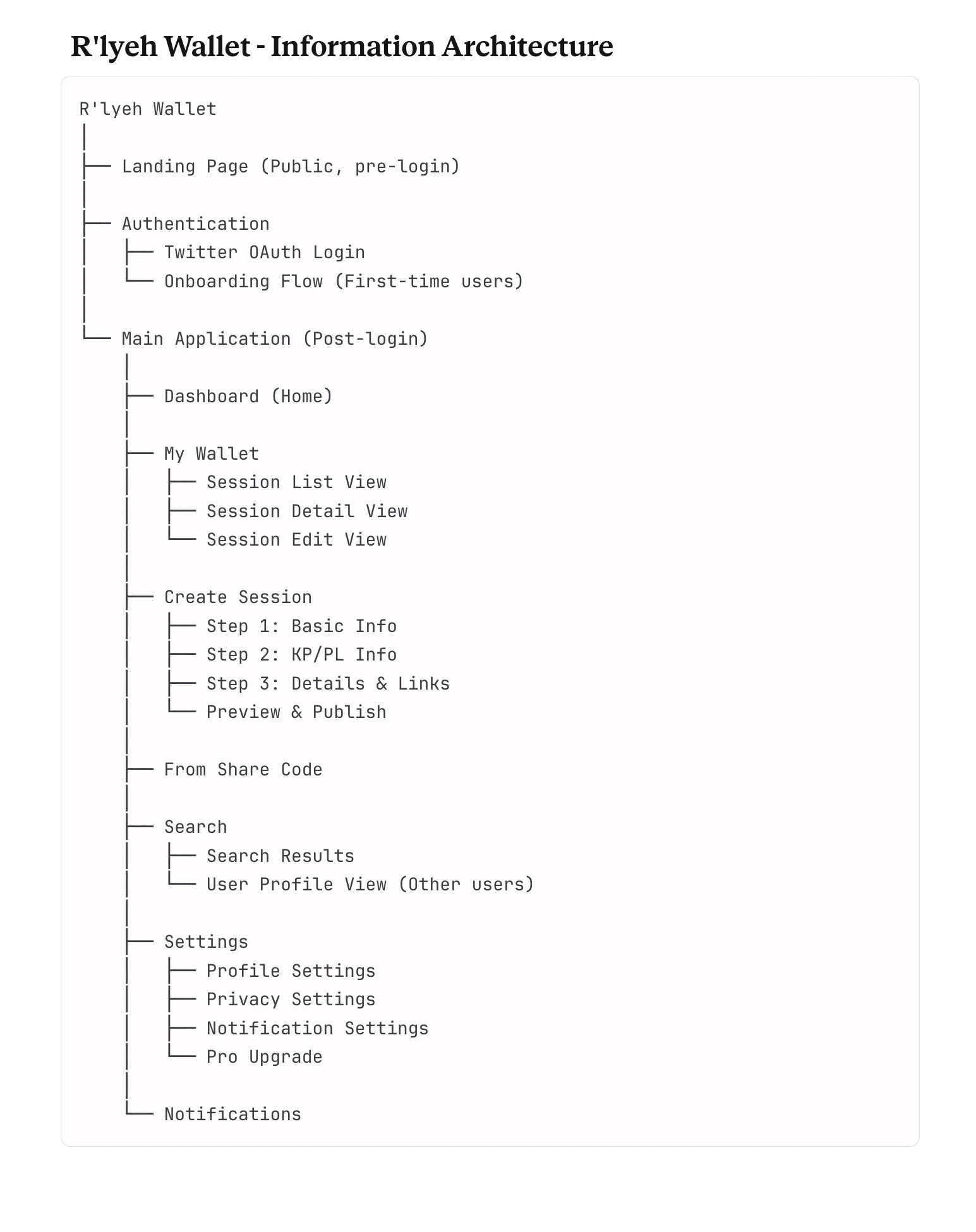
05. IA(Information Architecture)
From the research insights, I proposed the Information Architecture by categorising the features needed for an MVP.
The main focus is to organize tools.
So, according to that, sections for Wallet, Session Recording, and Search have been added.
I utilized markdown so that features could be organized based on its categories. This is important because implementing feedback becomes easier once clear IA is established.
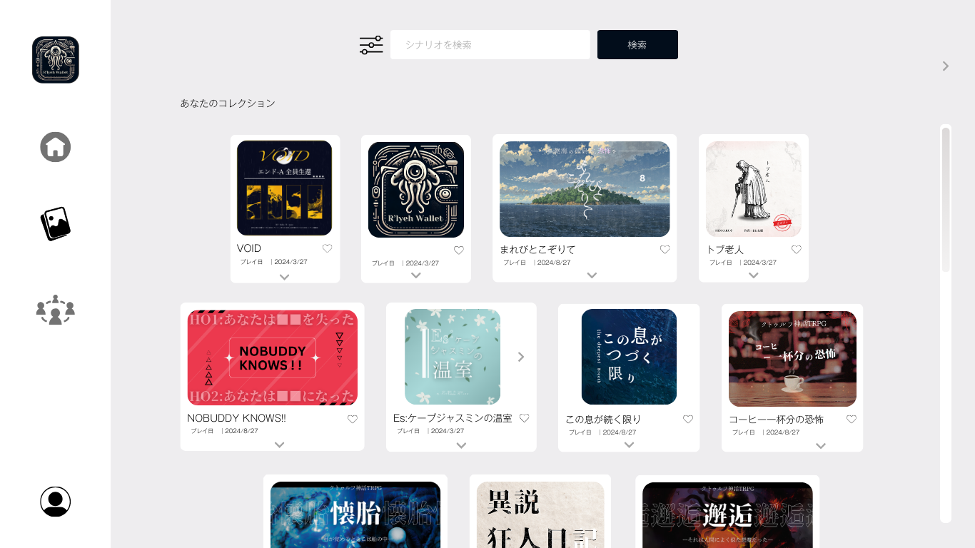
06. Low Fidelity Prototype
In this process, I could have done a better job with the details.
We conducted a Regulated Usability Study to receive feedback for the basic functions: adding cards and reviewing gallery.
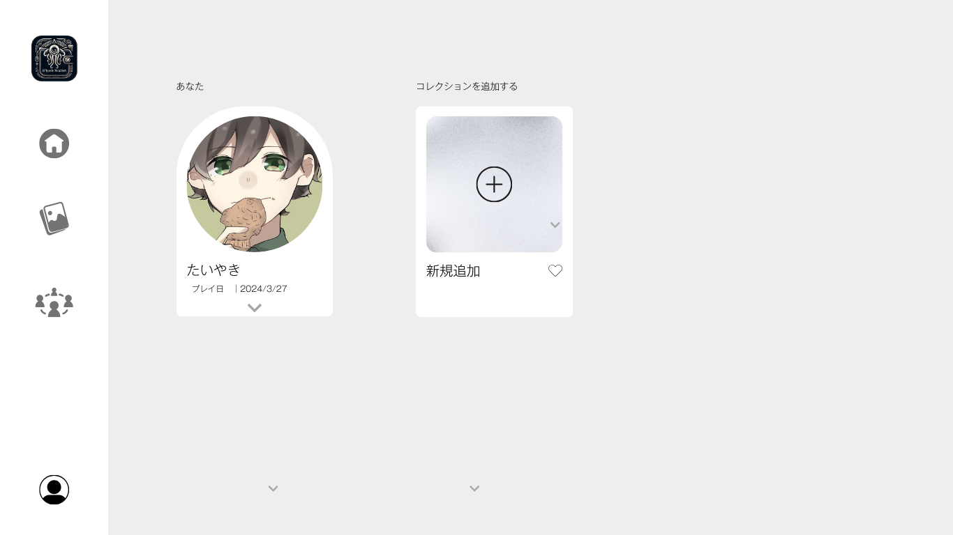
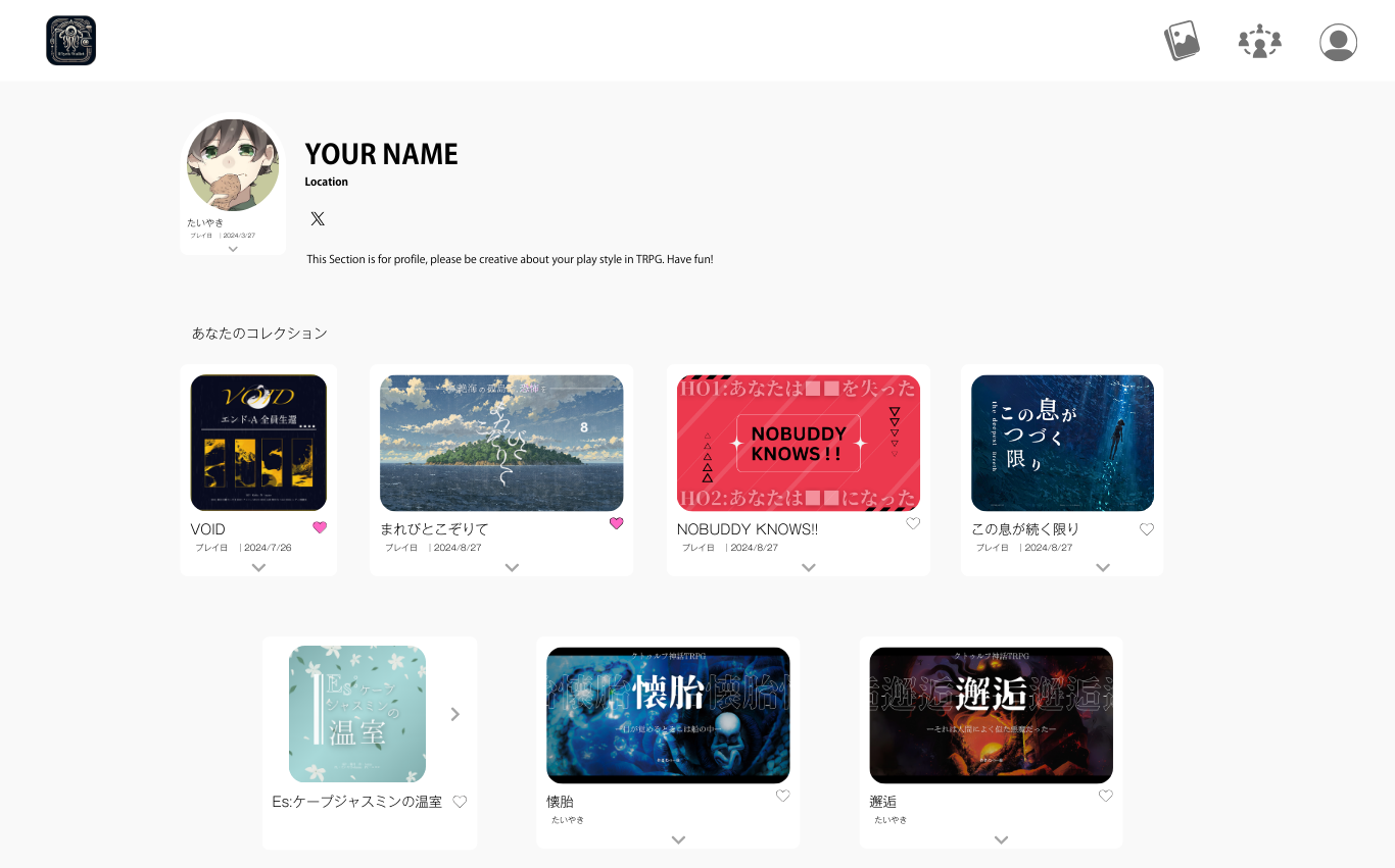
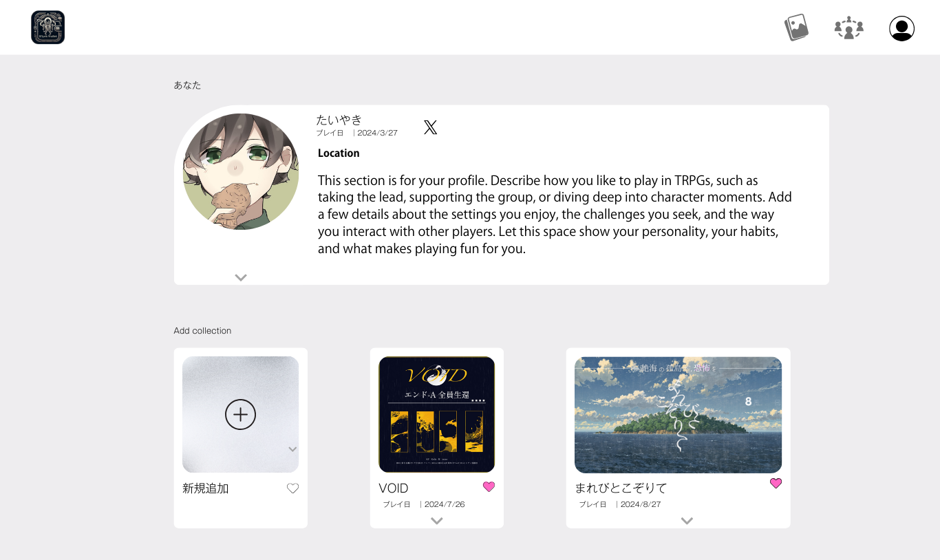
Home page
Collections
Socials

Profile
Key Insights
01
Ease of adding the card:
One of the feedback was to simplify the step to create the card. One of the test users mentioned that the core feature should be obvious to new people.
02
Navigation:
Without being explained, 2 of the user could not navigate what each screen where supposed to do.
Utilizing navigation and learning from pre-existing services will help users intuitively know what to expect on the screen.
After Usability Study
07. Mockup
At the time of this project, I was not aware of what a mockup is.
Therefore, this project directly went into the High Fidelity Prototype.
I know how crucial Mockups are because it can increase feedback while reducing revisions.
Since learning more about UX, I gained experience in each steps core meaning.
08. High Fidelity Prototype
Through interaction, we realized two things.
Users wanted to keep memories with the people they played with. Major tools did not cover this process after the game, and that was needed more than organizing the session itself or onboarding to the board game.
Now it has narrowed down from a comprehensive archive to a specific archive targeting the core issue that could be solved easily.
Closing
Winning moments
The winning moment was when I spoke with the potential user and received the feedback. It was not just the change in assumption for usability, but rather the core feeling of the users that mattered the most. This led to an incomplete project on my side, but resulted in a better outcome overall.
Lessons Learned
After learning about the importance of low-fidelity prototyping in the Google UX course, I would start with paper wireframes to test core concepts with users before investing time in detailed mockups. This would have helped me fail faster and iterate more efficiently.